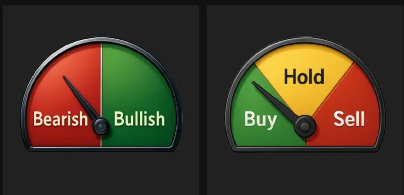
🧭 Decoding the Trend Dashboard: Bullish, Bearish, Neutral
When you log in to Sussurro, the first thing you see is the Painel de Tendências.
This is your “at-a-glance” control panel that tells you what the market is doing agora mesmo — without you needing to read charts or guess. 😎
The Trend Dashboard usually shows 3 core states:
- 🟢 Otimista
- 🔴 Grosseiro
- 🟡 Neutral (or Hold)
Let’s break down what each of these means and how to use them.
🟢 Bullish – Market in Growth Mode
When the Trend Dashboard shows Otimista, it means Whisber’s AI has detected:
- Positive momentum
- Stronger buying pressure
- Higher chance of upward price continuation
What you can do in Bullish mode:
- Procurar entry opportunities
- Continue to hold existing positions
- Consider scaling in (if long-term trend also agrees)
💡 Pro tip: Bullish on both long-term and short-term = strongest setup.
🔴 Bearish – Market in Protection Mode
When the dashboard is Grosseiro, the AI has picked up:
- Selling pressure
- Weakening trend structure
- Potential for further downside
What you can do in Bearish mode:
- Protect capital 💰
- Avoid FOMO buys
- Take profit on weak positions
- Wait for the next uptrend signal
This is where Whisber helps you avoid emotional mistakes — you don’t have to guess if the dip is real. The dashboard tells you.
🟡 Neutral / Hold – Market is Not Clear
Sometimes the market is not strongly up or down — it’s moving sideways, or momentum is mixed.
That’s when the dashboard shows Neutral (or Segurar).
This means:
- No strong edge right now
- Don’t force trades
- Good time to observe, not react
What you can do in Neutral mode:
- Stay patient 🧘♂️
- Wait for the next clear signal
- Avoid overtrading
Neutral is underrated — it’s the state that saves you from unnecessary losses.
🖼 Where the Signals Come From
Your screenshots show things like:
- ✅ A medidor pointing to Bullish/Bearish
- ✅ A Comprar / Manter / Vender style meter
- ✅ A mapa de calor showing past signals
These are different visual ways of showing the same AI decision:
- Gauge = current mood
- Heatmap = how it has behaved over time
- Suggested action = what you should do with that info
So even if you’re not a trader or chart pro, you can still read the market in 3 seconds. ⏱
🧠 How to Use the Dashboard in Real Life
- Check the trend first → Bullish, Bearish
- Match it with your plan → Are you entering, holding, or waiting?
- Follow the AI suggestion → Don’t let social media push you opposite of the trend
- Combine with long-term trend → If long-term is Bearish but short-term is Bullish, it might just be a bounce
✅ Why This Matters
Most people lose in crypto because they trade against the trend or trade when there’s no clear trend.
Your Trend Dashboard solves that.
It gives you instant clarity so you can ask:
“Is this actually a good time to trade… or should I wait?”
And that’s how you trade smarter with Whisber. 💚